Users often perceive an aesthetically pleasing design as a design that’s more usable.
Summary: Users are more tolerant of minor usability issues when they find an interface visually appealing. This aesthetic-usability effect can mask UI problems and can prevent issue discovery during usability testing. Identify instances of the aesthetic-usability effect in your user research by watching what your users do, as well as listening to what they say.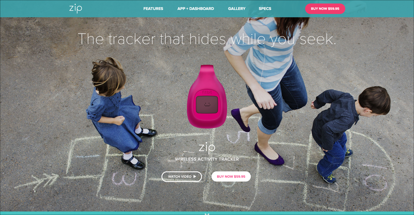
During usability testing, one user encountered many issues while shopping on the FitBit site, ranging from minor annoyances in the interaction design to serious flaws in the navigation. She was able to complete her task, but with difficulty. However, in a post task questionnaire, she rated the site very highly in ease of use. “It’s the colors they used,” she said. “Looks like the ocean, it’s calm. Very good photographs.” The positive emotional response caused by the aesthetic appeal of the site helped mask its usability issues.
Definition: The aesthetic-usability effect refers to users’ tendency to perceive attractive products as more usable. People tend to believe that things that look better will work better — even if they aren’t actually more effective or efficient.
In other words, users have a positive emotional response to your visual design, and that makes them more tolerant of minor usability issues on your site. In most cases, this is a positive thing from your perspective. This effect is a major reason why a good user experience can’t just be a functional UI — designing an interface that’s attractive as well as functional is worth the resources.
Bear in mind that the aesthetic-usability effect has its limits. A pretty design can make users more forgiving of minor usability problems, but not of larger ones. (As the first law of e-commerce states, if the user can’t find the product, the user can’t buy the product. Even great-looking sites will have no revenue if they suffer from poor findability.) Form and function should work together. When interfaces suffer from severe usability issues, or when usability is sacrificed for aesthetics, users tend to lose patience. On the web, people are very quick to leave.
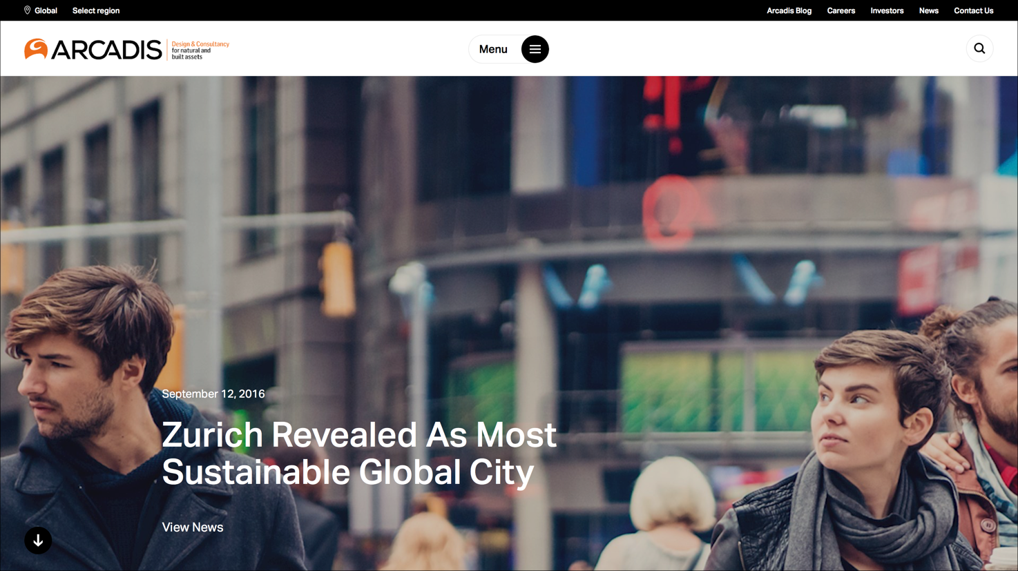
Arcadis, a consultancy, uses large background photos on many pages throughout the site. During a usability test, a participant responded positively to the site’s aesthetics: “First thing, popping into this webpage, I see this beautiful, colorful image.” After struggling to complete several tasks, however, the participant revised his opinion of the same design detail: “I feel like the whole screen being taken by this is pretty awesome once… And probably annoying the second time.”
Audi or Skoda?
Let’s just shift to Car Design for a moment. Cars have been around for ages - since Ford’s little black number. They all pretty much do the same thing and look similar. Four wheels, seats, they go from point A to B. Why do people buy one over the other? One word. Design.
Aesthetics and Car Design have been fused for many years. It’s what defines a car, it’s what gives a car it’s personality and importantly for the manufacturers, it’s what gives the car it’s competitive edge in the marketplace.
Conclusion
Aesthetically pleasing interfaces are worth the investment. Visual designs that appeal to your users have the side effects of making your site appear orderly, well designed, and professional. Users are more likely to want to try a visually appealing site, and they’re more patient with minor issues.
However, this effect is at its strongest when the aesthetics serve to support and enhance the content and functionality of the site. Additionally, this effect often influences user comments during research. As always, listen to what users say, but, first and foremost, take into account what they do.
References
Kurosu, M., & Kashimura, K. (1995). Apparent Usability vs. Inherent Usability. Conference companion on Human factors in computing systems - CHI '95.
Norman, D. A. (2004). Emotional Design: Why We Love (Or Hate) Everyday Things. New York: Basic Books.
Comments
Post a Comment